Friday, April 22, 2011
4/18-22
This week we have been working on collages. This week I have done three two practice ones and my final one. My first two are just kind of plain and easy. My final collage is an elephant. It was kind of hard to get the right shape but think I got close. I have learned a lot about technique and I think making colleges is really fun!
Friday, March 4, 2011
week 7
This week i have had lots of fun with water colors and our seascapes. I quite enjoyed working from my memory and incorporating a little bit of imagination. Water colors blend well but can sometimes bleed which i figured out by experience but it was lots of fun and i really like how my seascape turned out.
Friday, February 18, 2011
week 5
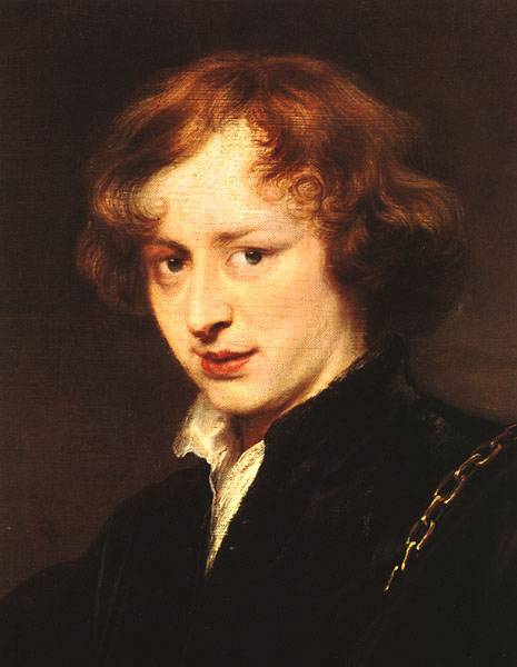
this week i have learned a lot about the barouqe era and my artist anthony van dyck. I also finished my self portrait this week which was exciting because i didn't really like it so i was kind of glad it was over.
Wednesday, February 16, 2011
Baroque Art- Anthony van Dyck
Anthony Van Dyck
My artist is Anthony Van Dyck. He was born on March 22, 1599. Anthony was born in Antwerp and became a famous Flemish baroque painter. Peter Paul Rubens had a big influence on him as an artist and person.
Van Dyck was a Flemish painter. He and another friend of his were known for mainly doing Court portraits. He later on stated to do prints of his work. He and his friend named Diego Velázquez competed for work in the Courts.
A defining trait that would make you be able to tell that Anthony van Dyck was a Baroque artist was the way he portrayed people. He made them look much better than they did and put them is strange positions. Anthony van Dyck made a huge impact painting noble men and women and is greatly remembered for his Charles I painting. Painting noble men and women also gets you noticed because lots of people look at them for historical uses and then see the portraits of them.
Anthony van Dyck was considered a part of the Baroque period because of the way he portrayed people. Major characteristics of the Baroque period were post-Renaissance architecture being unstructured, unornamented, theatrical, and grotesque. Anthony van Dyck was Baroque because he “immortalized” noblemen.
Van Dyck's influence on English art has been lasting. Gainsborough was very inspired by van Dyck’s portraits, as well as others until the early 20th century, when portraits went out of style. He also painted religious and mythological subjects and landscapes. He also started etching which later became very popular and is still used today.
I like that Anthony van Dyck made the royal people look better than they really were because that is like really funny. He defiantly deceived some people with his paintings. I also like that he did his own thing even when he had competition for the same type of art as him.


Wednesday, February 2, 2011
Symbolic colors
White: blank, bored, clouds, plain
Black: scary, dark, intimidating, dreary
Grey/Brown: basic, earthy, dull, tame
Yellow: sun, happy, warm, inviting
Orange: sun, content,
Red: hot, wild, crazy, blood
Green: vibrant, colorful, cool
Blue: water, calmness, serenity
Violet: bright, happy, rich, playful
Black: scary, dark, intimidating, dreary
Grey/Brown: basic, earthy, dull, tame
Yellow: sun, happy, warm, inviting
Orange: sun, content,
Red: hot, wild, crazy, blood
Green: vibrant, colorful, cool
Blue: water, calmness, serenity
Violet: bright, happy, rich, playful
Wednesday, January 5, 2011
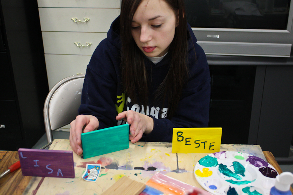
Project
1 I made some name block hanging ornaments.
2 Well the first thing I did was cut some wood in my dads shop, then i used a wood burner to write names on the wood. After that I painted over top of the burning and inside the burning with a different color.
3 I used a saw, a wood burner, paint, paint brushes, and a drill.
4 I focused on learning different ways to use the wood burner.
5 I really liked using the wood burner and learning more about it, I had some trouble with the painting and the wood falling over and paint got every where!
6 I think that I did pretty well on the wood burning for using it for the first time.


My project definitely learned a new skill, it also had good contrast with the colors I used. I followed through with one of the ideas I said I would, I had to make deliberate choices which weren't that hard to make, and it does really make me want to learn more about wood burning and other projects involving wood.

2 Well the first thing I did was cut some wood in my dads shop, then i used a wood burner to write names on the wood. After that I painted over top of the burning and inside the burning with a different color.
3 I used a saw, a wood burner, paint, paint brushes, and a drill.
4 I focused on learning different ways to use the wood burner.
5 I really liked using the wood burner and learning more about it, I had some trouble with the painting and the wood falling over and paint got every where!
6 I think that I did pretty well on the wood burning for using it for the first time.

My project definitely learned a new skill, it also had good contrast with the colors I used. I followed through with one of the ideas I said I would, I had to make deliberate choices which weren't that hard to make, and it does really make me want to learn more about wood burning and other projects involving wood.

Friday, October 22, 2010
Q2-places
One place I would like to go to would be a cafe that had art shows or art contests and I would assume that it would be free to get in. I think those places are really cool because anyone can enjoy them anytime and I just think it makes coffee places look really awesome.
Another cool place to go would be PDX Contemporary Art. The art there looks pretty interesting and i would like to check it out.
925 NW Flanders Portland, Oregon 97209.http://pdxcontemporaryart.com/about/contact
I would like to check out Gallery 7126. It looks like really interesting art.
http://pdxcontemporaryart.com/about/contact
Subscribe to:
Posts (Atom)